This is an old revision of the document!
Table of Contents
Meta-Analytic Scatterplot
Description
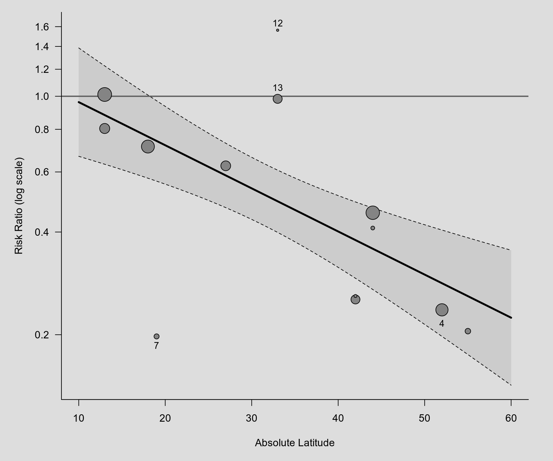
Below is an example of a scatterplot, showing the observed outcomes (risk ratios) of the individual studies plotted against a quantitative predictor (absolute latitude). The radius of the points is drawn proportional to the inverse of the standard errors (i.e., larger/more precise studies are shown as larger points). Hence, the area of the points is drawn proportional to the inverse sampling variances. Based on a mixed-effects model, the predicted average risk ratio as a function of the predictor is also added to the plot (with corresponding 95% confidence interval bounds). The scatterplot below is similar to Figure 1 in Berkey et al. (1995).
Plot
Code
library(metafor)

### calculate (log) risk ratios and corresponding sampling variances
dat <- escalc(measure="RR", ai=tpos, bi=tneg, ci=cpos, di=cneg, data=dat.bcg)

### fit mixed-effects model with absolute latitude as predictor
res <- rma(yi, vi, mods = ~ ablat, data=dat)

### draw plot
regplot(res, xlim=c(10,60), predlim=c(10,60), xlab="Absolute Latitude", refline=0,
        atransf=exp, at=log(seq(0.2,1.6,by=0.2)), digits=1, las=1, bty="l",
        label=c(4,7,12,13), offset=c(1.6,0.8), labsize=0.9)
References
Berkey, C. S., Hoaglin, D. C., Mosteller, F., & Colditz, G. A. (1995). A random-effects regression model for meta-analysis. Statistics in Medicine, 14(4), 395–411.