Table of Contents
Contour-Enhanced Funnel Plot 2
Description
Here is another example of a contour-enhanced funnel plot (Peters et al., 2008) (see here for a brief discussion of the idea behind such plots). This one is a very close re-creation of Figure 2(b) from Peters et al. (2008). Note that the values for ylim technically have to be greater than 0 when using the inverse standard error on the y-axis, but we can get essentially the same limits by using a very small value for the lower limit. Also, the dataset used by Peters et al. (2008) contains an extra study, which isn't included in the Cochrane review by Graves et al. (2010).
Plot
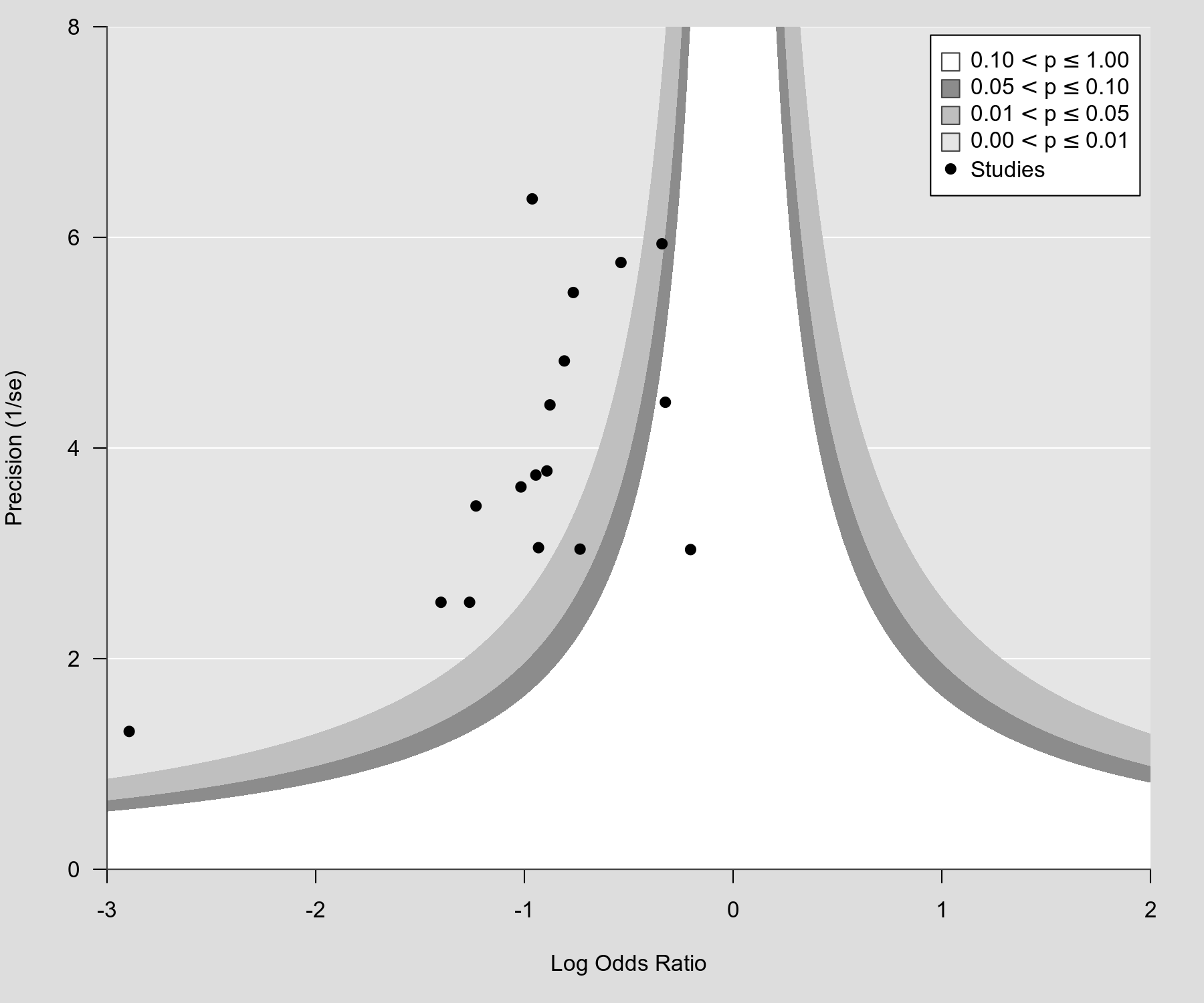
Code
library(metafor)

### calculate log odds ratios and corresponding sampling variances
dat <- escalc(measure="OR", ai=ai, n1i=n1i, ci=ci, n2i=n2i, data=dat.graves2010)

### create contour enhanced funnel plot
funnel(dat$yi, dat$vi, yaxis="seinv", ylab="Precision (1/se)",
       xlim=c(-3,2), ylim=c(.00001,8), xaxs="i", yaxs="i", las=1,
       level=c(.10, .05, .01), legend=TRUE, back="gray90", lty=0)
References
Graves, P. M., Deeks, J. J., Demicheli, V., & Jefferson, T. (2010). Vaccines for preventing cholera: Killed whole cell or other subunit vaccines (injected). Cochrane Database of Systematic Reviews, 8, CD000974.
Peters, J. L., Sutton, A. J., Jones, D. R., Abrams, K. R., & Rushton, L. (2008). Contour-enhanced meta-analysis funnel plots help distinguish publication bias from other causes of asymmetry. Journal of Clinical Epidemiology, 61(10), 991–996.